Glendale App – Your Ultimate Guide
How to Install the Glendale App:

The Glendale app isn’t available in the App Store like most apps. To get it, you need to go to this website: https://aurora-alerts.uk/
For Android Users:
1. Open https://aurora-alerts.uk/ in your phone’s browser.
2. Tap the Install button on the website or add the site to your home screen.
3. Your phone will create and install the app (APK file) automatically—just like it would if you downloaded it from the App Store.
For iPhone or iPad Users:
1. Open Safari and go to https://aurora-alerts.uk/
2. Tap the Share button (a square with an arrow pointing up).
3. Swipe through the options and tap “Add to Home Screen.”
4. Tap “Add” at the top right.
You’ll now see the app icon on your home screen like any other app.
Top of Glendale App
At the top of the Glendale app, you’ll see live Aurora alerts and how far north the Aurora might be visible. It gives you real-time updates on current Aurora conditions and when the next burst of energy might happen.
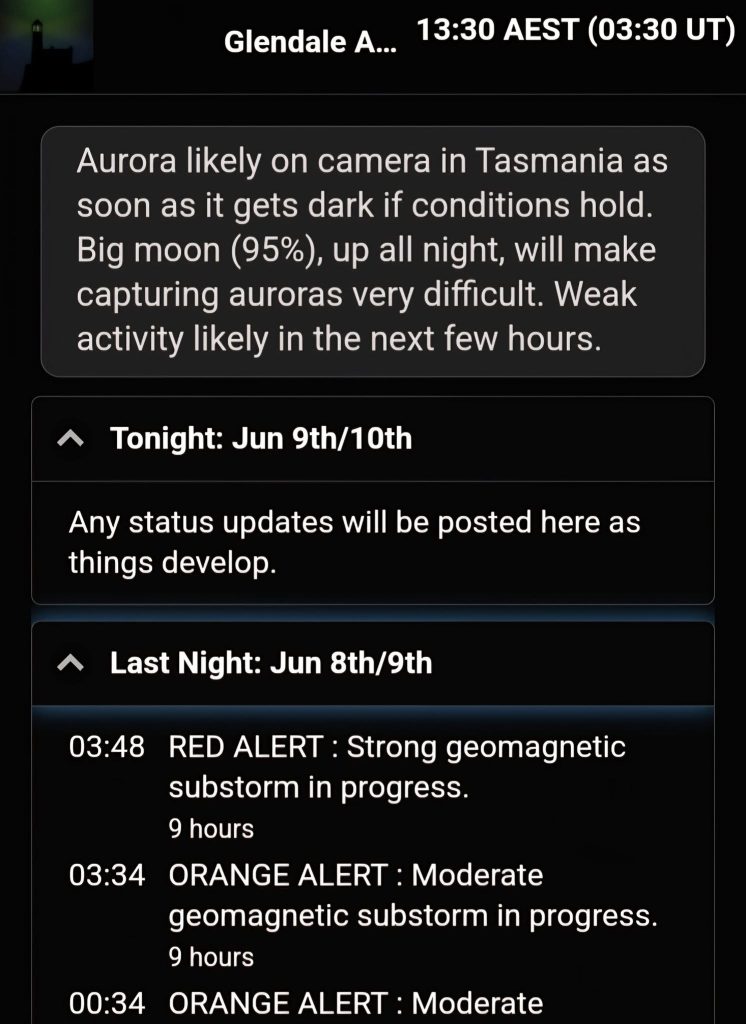
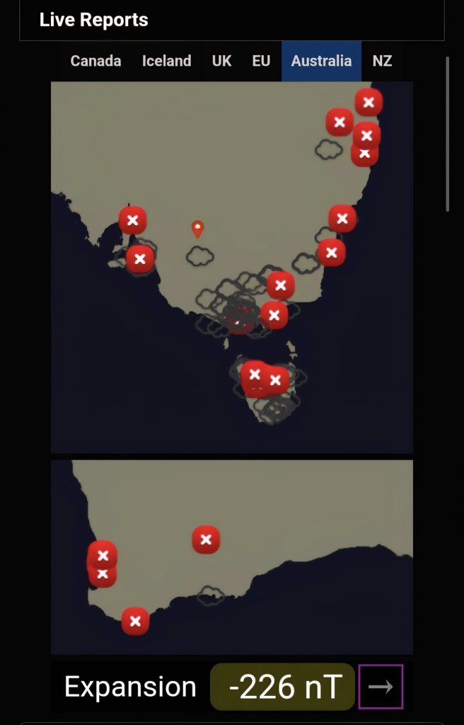
Live Reports
You’ll also find status updates from tonight and last night—these might include things like an interplanetary shock, a solar flare, and more.
If there’s an alert, it will be colour-coded as yellow, orange, red, or purple, depending on the intensity.
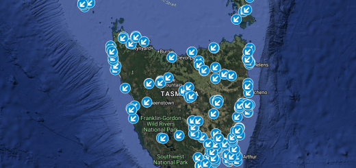
The app shows live Aurora reports from different regions.
Here’s what the symbols mean:
Red X – The sky is clear, but no Aurora is visible.
Cloud symbol – It’s cloudy, so there might be Aurora behind the clouds, but it’s hard to tell.
Green ticket – Aurora is visible!
Pink tick – A faint or diffuse Aurora is visible.
Unfortunately, there is no option to zoom in on the app for privacy reasons.
At night, you’ll also have the option to report if you see an Aurora. The number of options you see may change depending on how often and how long you’ve been using the app.
Below the live reports, you’ll see something called Substorm Strength – this tells you how strong the Aurora currently is. The arrow next to it shows the direction the activity is heading.
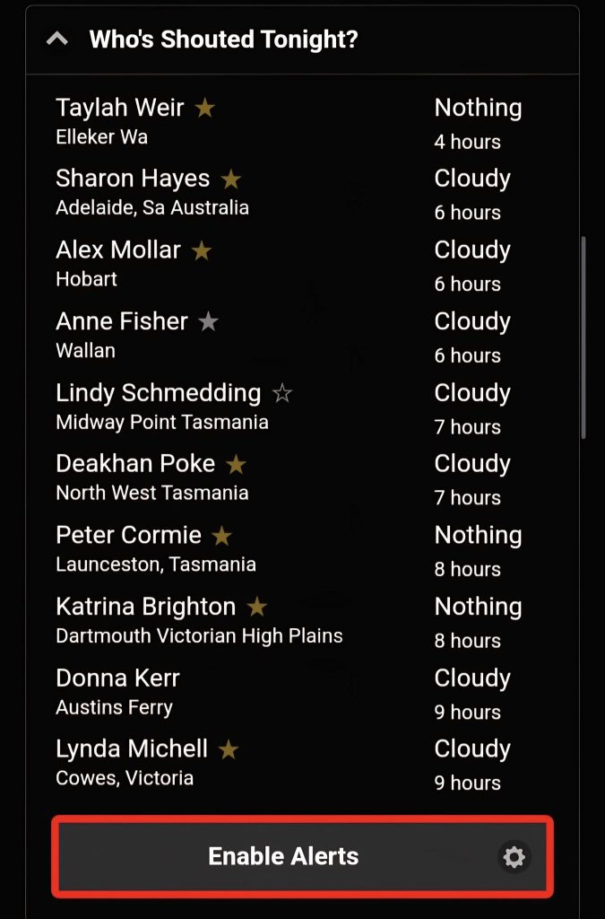
Who’s shouted tonight
Gives you a list of people who has shouted and from where. There is also an option to enable alerts for the app.
Substorm Tracker – What It Means
The number you see at the top (like -209 nT) tells you how strong the Aurora is in the sky right now. This number is called the substorm strength.

You want the number to be negative – the more negative it is, the stronger the Aurora is.
Falling numbers = good (Aurora getting stronger)
Rising numbers = bad (Aurora fading)
This is the most important number on the whole app—it updates in real time and shows what’s actually happening in the sky.
What the Words Mean:
Growth = The sky is “charging up” like a battery.
Expansion = The charged-up energy is now being released as Aurora.
Recovery = The Aurora is fading.
The Line Graph (Trendline):
It shows how the substorm strength has changed over the last hour.
If the line drops quickly, that’s a good sign—Aurora is getting stronger.
If the line rises, that’s not good—Aurora is weakening.
The blue shaded area is just the normal background level.
IMF (at Earth)
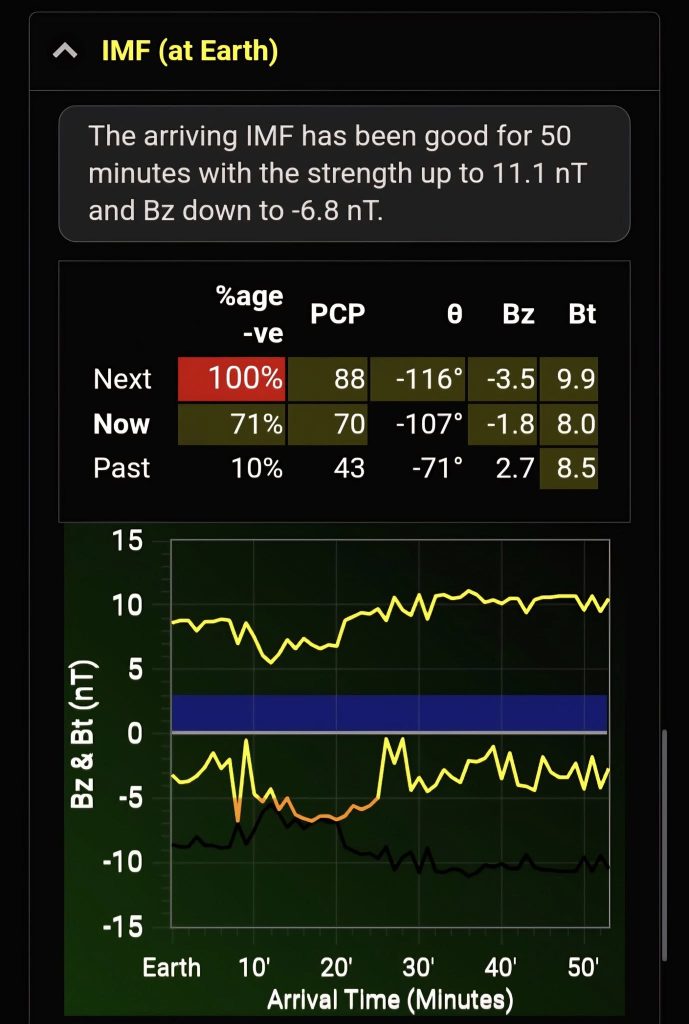
The top summary gives you an high level summary on how good or bad the incoming IMF is.
IMF (Interplanetary Magnetic Field) – What It Tells Us
The IMF doesn’t show what’s happening right now. Instead, it helps us predict Aurora activity 1 to 3 hours ahead.
What the Table Shows:
It shows how the magnetic field (specifically the Bz) looked during a 30-minute window that’s just arriving at Earth, along with the time just before and after.
The percentage tells you how much of that time the Bz was negative.
100% negative is best – that means the magnetic field was pointing south the whole time, which is great for Aurora.
What the Rows Mean:
If both “now” and “next” rows are lit up, a substorm is either already active or is likely to start within an hour.
If the “next” row is not lit, activity might start to fade. But sometimes there can still be a surprise burst, so hang around for another hour just in case.
When a Substorm Is Already Happening:
Ignore all the IMF/Bz predictions once a substorm is in its expansion phase (meaning it’s already going strong).
→ Substorm strength is the most important thing to watch at that point.
Understanding the Graphs:
You’ll see two trendlines:
Left side = magnetic data arriving now
Right side = predictions based on satellite data from space
Bt (total magnetic strength) is at the top
Bz (north/south direction) is in the middle
Ideal Bz (perfect conditions) is shown as a black line at the bottom
The middle line (Bz) is the key one:
You want it to be as far below the blue area as possible, and close to the black line.
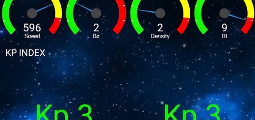
Solar Wind and Aurora – What Matters and What Doesn’t
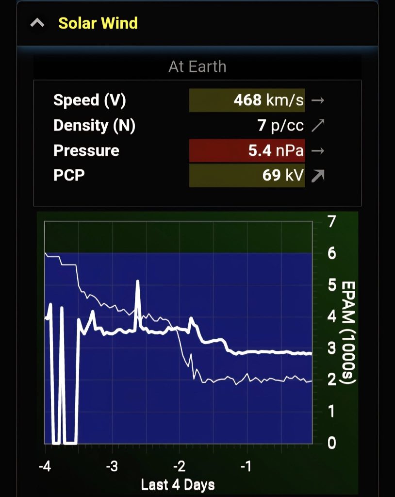
The solar wind’s speed, density, and pressure are always being measured as they reach Earth. But these don’t directly cause auroras.
What does matter is the IMF (Interplanetary Magnetic Field).
A strong IMF can create auroras even if solar wind speed and density are normal.
Why We Watch Solar Wind Data:
We use it to spot space weather events—especially shocks, which show up as big jumps on the graphs. These shocks can bring a good IMF.
What the EPAM Chart Tells Us:
This chart shows low-energy particles hitting Earth.
Thick line = protons
Thin line = electrons
If the lines suddenly go up fast, that means a space weather event is on the way.
A sharp rise in proton levels often happens just before an interplanetary shock hits.
Understanding the Graphs:
The graphs show:
V = solar wind speed
N = density
T = temperature
B = magnetic field strength
Left side = what’s hitting Earth now
Right side = what’s coming next (based on satellite data). The duration varies based on Solar wind speed.
Blue shaded areas = normal background levels
Coronal Holes and Aurora – What You Need to Know
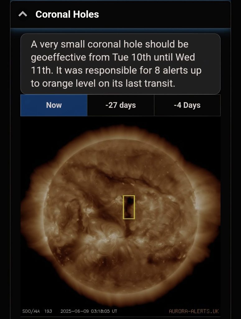
Most auroras come from something called coronal holes on the Sun. These are common and usually repeat every 27 days.
When a coronal hole is facing Earth, it sends out fast-moving solar wind. That wind takes about 3 to 4 days to reach us and can create auroras.
How to Use the Tabs:
‘Now’ vs ‘-27 days’: Lets you compare what the Sun looks like now with how it looked 27 days ago—helpful for spotting returning coronal holes.
‘-4 days’: Shows what the Sun looked like 4 days ago, when that coronal hole was facing Earth and likely caused the current aurora activity.
CMEs (Coronal Mass Ejections) – Big Solar Blasts
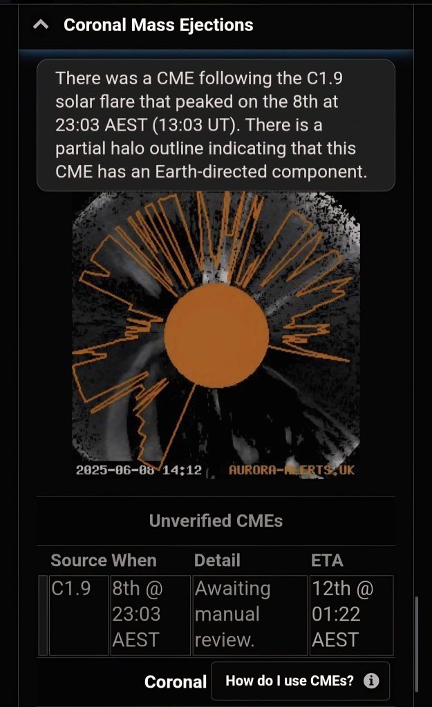
CMEs are big bursts of solar stuff (plasma) that shoot out from the Sun. They can come from sunspots, solar flares, or filaments—and if they hit Earth, they can cause really strong auroras.
What to Look For:
In the graphic, you want to see plasma covering more than half of the Sun (this is called a partial halo).
The best sign is a full halo—where plasma seems to surround the whole Sun.
If it’s Earth-directed, the CME usually takes 2 to 3 days to reach us.
A Few Warnings:
Even if it looks like it’s heading straight for Earth, it might miss completely or just bounce off our magnetic field.
Don’t get too excited until the app confirms a shock has been detected—that means it’s actually arriving.
ETA times are just rough guesses, so don’t take them too seriously!
Unverified CMEs are ones the app has picked up automatically but haven’t been double-checked yet to make sure they’re real and heading our way.
Solar Flares – What They Mean for Auroras
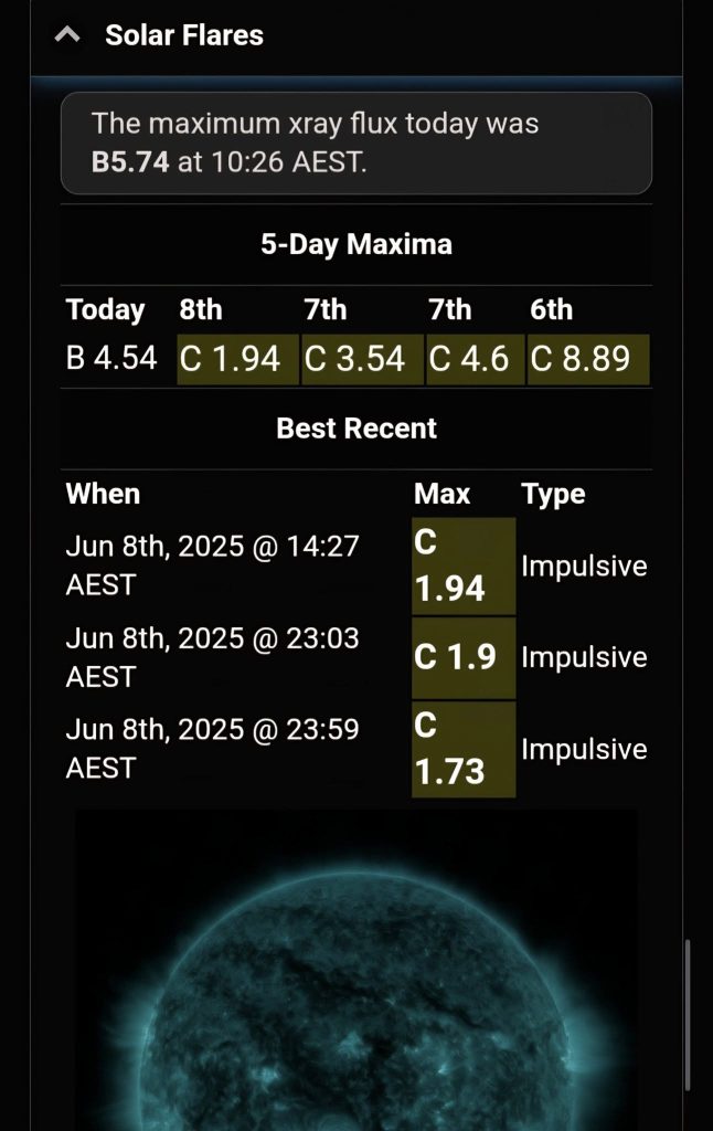
Sometimes, a solar flare (a big flash from a sunspot) can cause a CME (a blast of solar material).
If that CME is heading toward Earth, it can cause strong auroras 2 to 4 days later.
But here’s the thing:
Most flares don’t create a CME.
Most CMEs don’t hit Earth.
So don’t get too excited just because there’s been a flare!
Flare Strength:
Flares are ranked by letters:
B, C = small
M = medium
X = big!
The number next to the letter tells you how strong it was within that class.
What to Do After a Flare:
It takes a few hours before we get images to confirm:
Was there a CME?
Is it heading to Earth?
So after a flare happens, check the CME panel in the app to get the latest info.
If there was a flare recently, the app will show a picture of the Sun with a yellow circle around the spot where the flare came from. If there hasn’t been a flare, it just shows the latest image of the Sun.
Long-Range Aurora Forecast
Black dates = Uncertain (maybe, maybe not).
Coloured dates = More likely to have aurora activity.
No date shown = No aurora expected.

This forecast is best used for dates 10 to 27 days in the future.
The Sun spins around once every 27 days, so the same coronal holes (which caused auroras this time) might come back around and give us another light show.
The forecast shows when those same solar wind streams could return.
But there’s no guarantee—they might have disappeared, or they might have grown even bigger!
It’s best not to use this data to plan a Aurora chase.
Twilight and Moon times
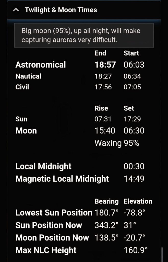
Gives useful information such as Astronomical twilight time, Moon rise/set, Sun rise/set in your selected location.
About You Section
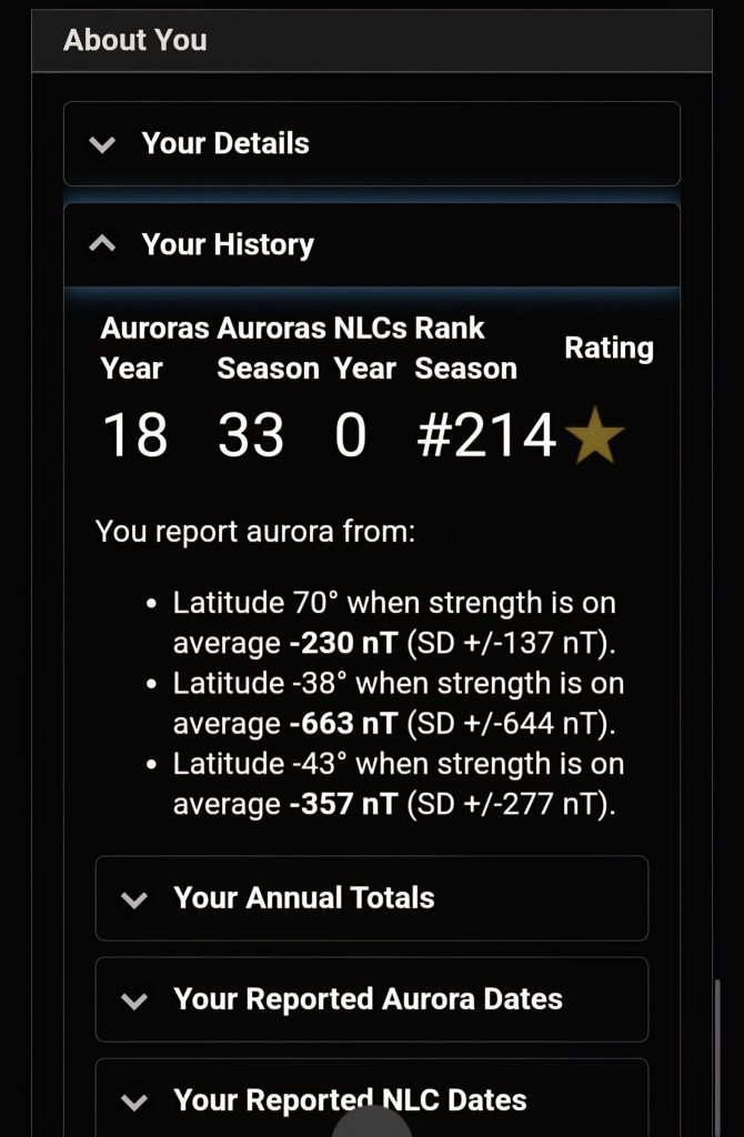
Section to update your current location details along with others stats.
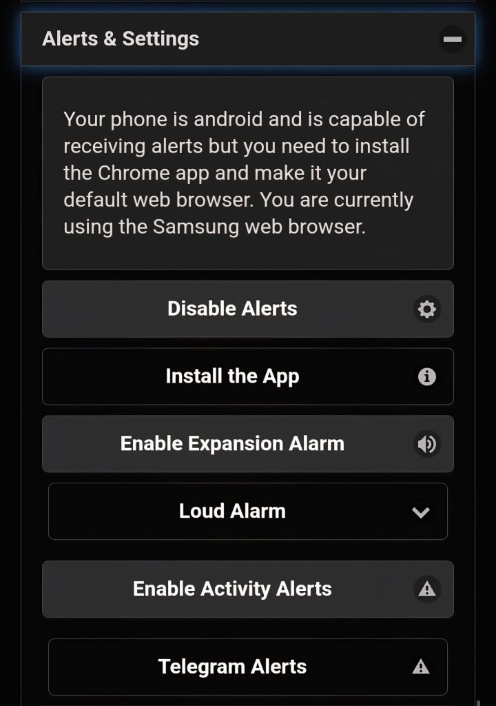
Section to enable/disable alerts
Substorm Strength (Last 24 Hours)
This chart shows how strong the aurora was over the past 24 hours.
The more negative the number, the stronger the aurora! It helps you see when the best aurora action happened.
IMF Strength – Last 24 Hours
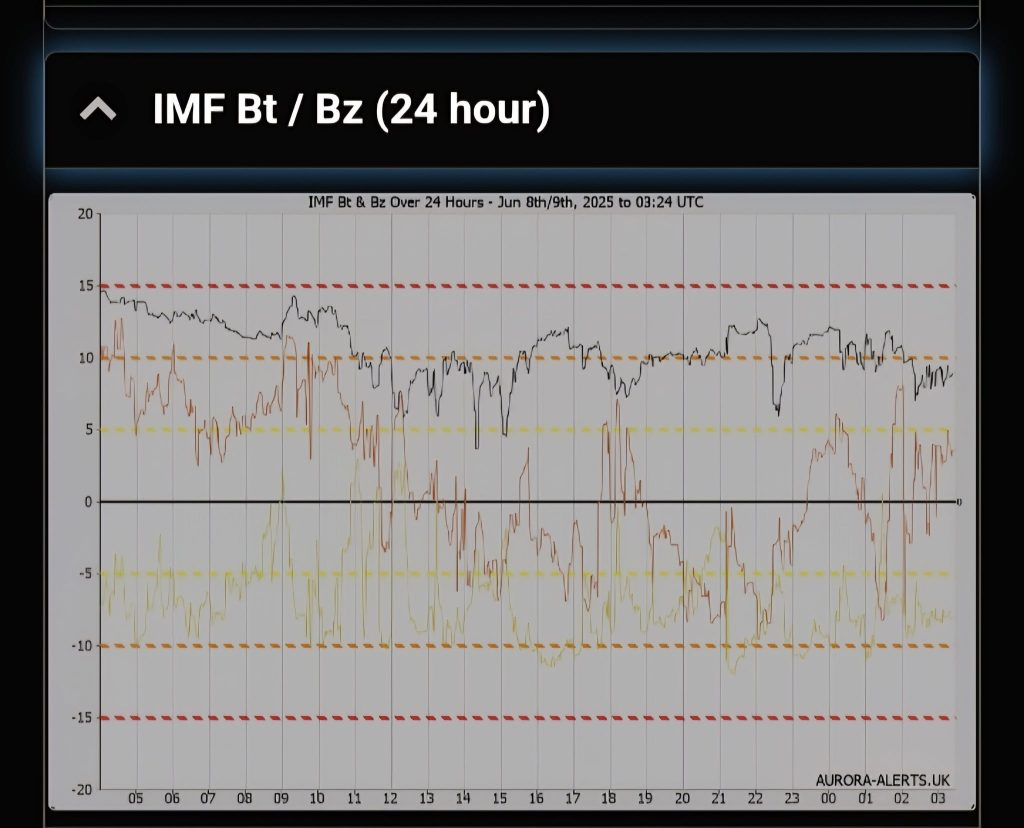
This chart shows three lines for the last 24 hours:
Black = Bt (total strength)
Red = Bz (north-south direction)
Green = By (east-west direction)
What It All Means:
Bt (Total Strength):
This shows how strong the magnetic field is overall.
Higher Bt = better chance for strong auroras.
Bz (North-South Direction):
This is the most important one for auroras!
Bz negative (southward) = good for auroras.
Bz positive (northward) = not so good.
By (East-West Direction):
This doesn’t directly affect auroras but works with Bz to figure out the magnetic field’s direction.

Clock Angle (By + Bz):
This is the angle created by combining By and Bz.
It helps us understand how the magnetic field is pointing and how well it can connect with Earth to trigger auroras.
Aurora Activity Changes – Last 24 Hours
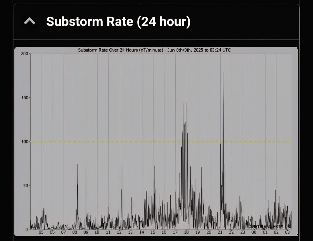
This chart shows how quickly the aurora’s strength has been changing over the past 24 hours.
It helps you spot the times when the aurora was most active and dancing in the sky.
Clock Angle – Last 24 Hours
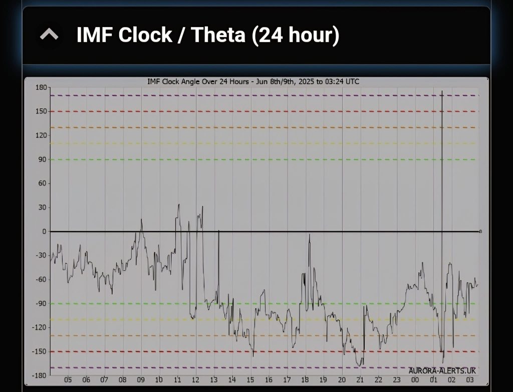
This chart shows the clock angle over the past 24 hours.
It helps you see when the Sun’s magnetic field (IMF) was best aligned with Earth, making it easier for auroras to happen.
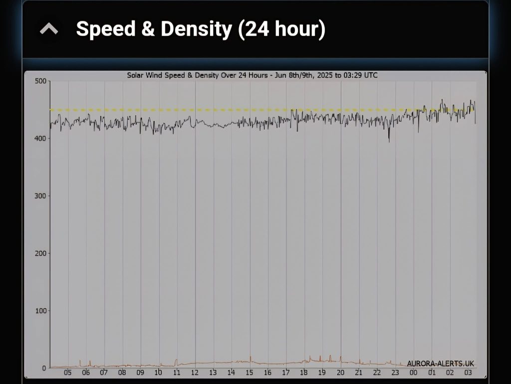
Speed and Density over a 24 hour period
Magnetometer Chart from Norway
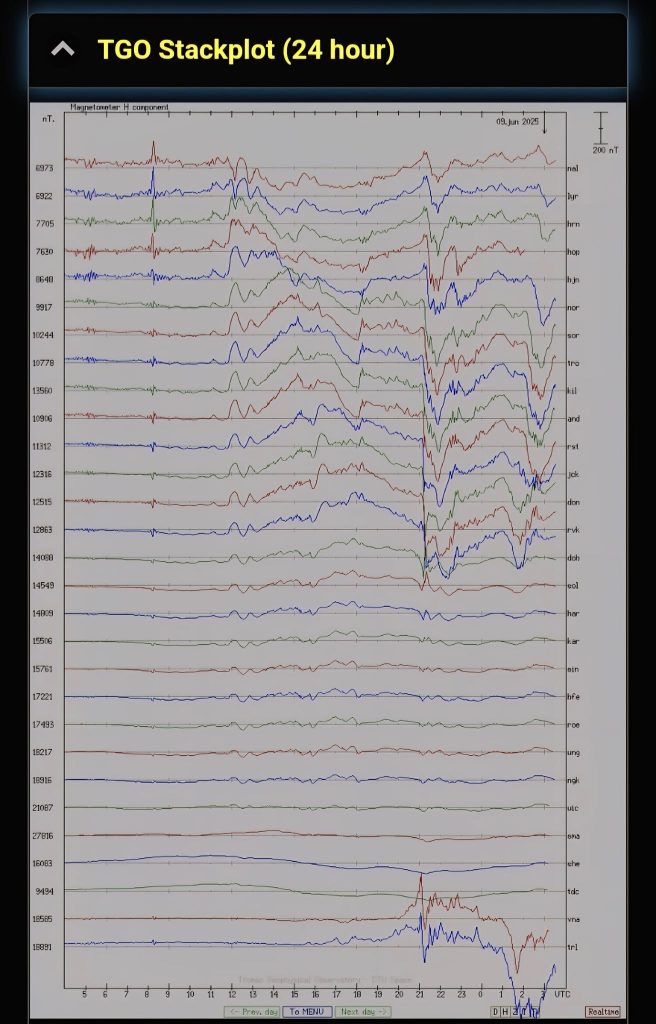
This chart shows magnetic activity measured at different stations across Norway, from north to south, over the last 24 hours.
Big drops (especially over 200nT) mean a substorm was happening.
These drops usually show up on the right side of the graph and mean the aurora was in its most active phase.
ACE Solar Wind (2 Hour)
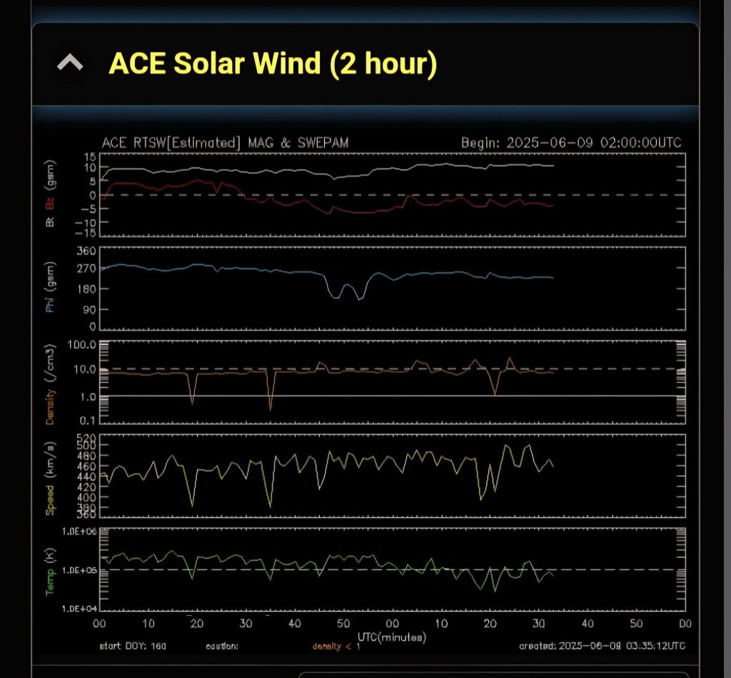
What we want to see:
Either a negative Bz (pointing south), or a big gap between the Bz and Bt lines in the last hour.
Both are good signs that aurora activity could be strong
ACE Solar Wind (6 hour)
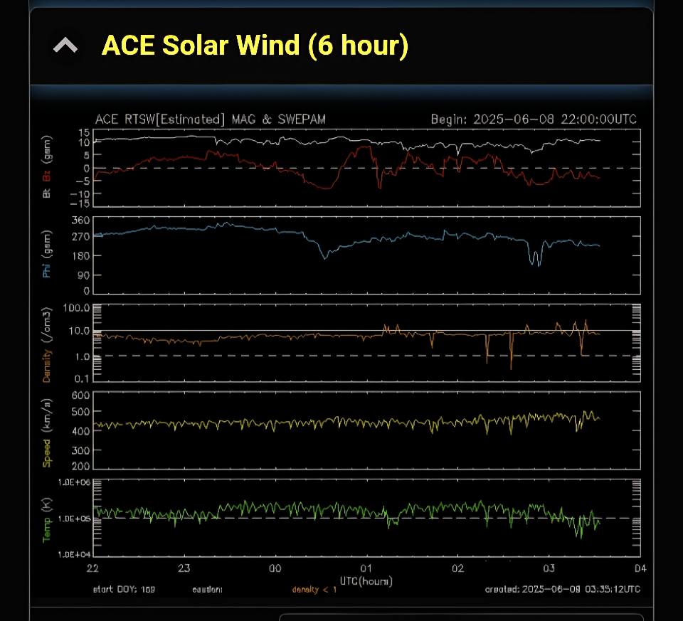
What we want to see:
Either a negative Bz (pointing south), or a big gap between the Bz and Bt lines in the last hour.
Both are good signs that aurora activity could be strong.
ACE Magnetic Field
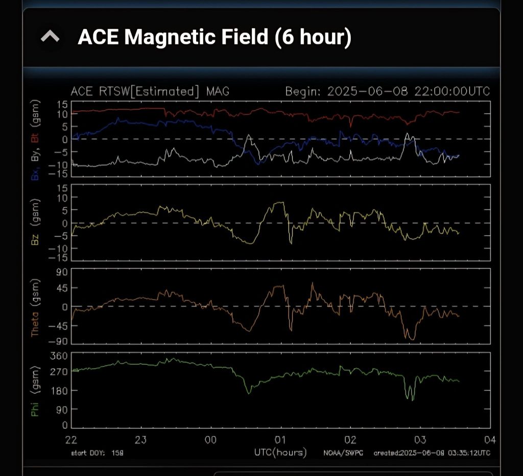
What we want to see:
Either a negative Bz (pointing south), or a big gap between the Bz and Bt lines in the last hour.
Both are good signs that aurora activity could be strong.
STEREO A IMPACT
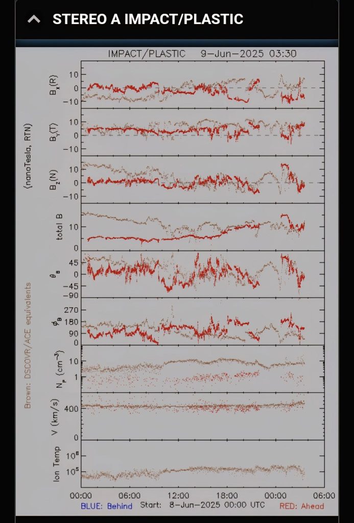
What we want to see:
Either a negative Bz (pointing south), or a big gap between the Bz and Bt lines in the last hour.
Both are good signs that aurora activity could be strong.
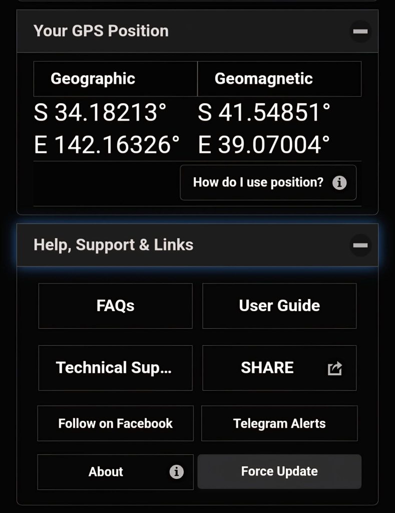
Your GPS Position
Last section on Glendale is for FAQs and also force update your app if your app is not yet up-to-date.